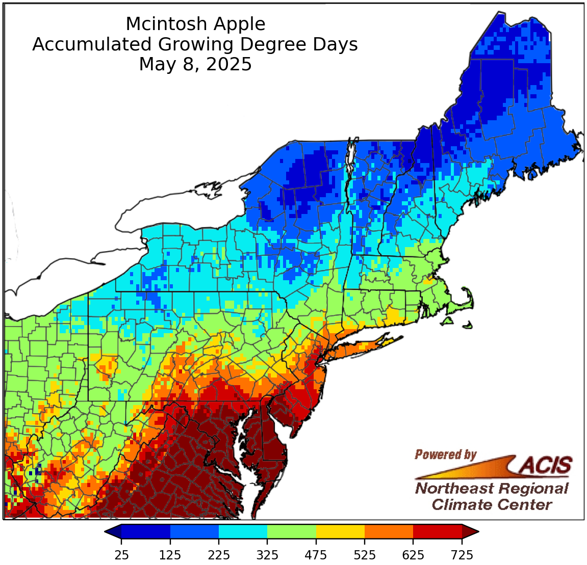
The Accumulated Chill map shows number of chill units acquired by the plant. The North Carolina Chill model (Shaultout and Unrath, 1983) is used. Growing Degree Days are a measure of heat accumulation and hence bud development. Base 43°F GDD accumulate only after the tree’s winter chill requirement (1000-1200 depending on variety) has been met. This map is a product of the Northeast Regional Climate Center, and part of a set of Apple Frost Risk Maps.
© Cornell University, 2016. Credits: Tool Developed by Art DeGaetano, Rick Moore & Ben Eck.
How do I use this tool?
Please take a few minutes to fill out a brief questionnaire on the CSF tools, so that we can continue to improve them, and develop new tools that are most needed! The questionnaire is voluntary and confidential, but we appreciate your input!
View our video tool tutorial on YouTube below:
Instructions on Using the Tool:
Choosing Your Location
- Click the “Change Location” button, which pops up a dialog box with text field and a map (click the small circle button at the top right to exit if needed)
- Create a new location by 1) entering your address, zip code, county, in the text field and clicking the “GO” button, OR 2) clicking on the map at any location in the Northeast
- The “Confirm Location Information” dialog box will appear after clicking “GO,” along with a yellow marker at the new location.
- Click “Save and Select” when you want to see the graph for your chosen location
- Click “Save” when the yellow marker is in the correct location, but you want to add more locations (the color of the new symbol will be changed to blue)
- Click “Cancel” when you do not want to keep the location
Selecting or Deleting Additional Locations
- You may select or delete a location from those already shown (upon clicking “Change Location”) by hovering and then clicking on an existing symbol once the white box with existing location details has appeared
- The “Confirm Location Information” dialog will appear at the top of the map
- Click “Select” when you want to see the graph for that location. When the dialog box closes, the color of the selected location’s marker will be changed to red, and the color of the previously selected marker will be changed to blue. The dialog box will close and your graph will appear
- Click “Delete” to delete the location, immediately removing the marker from the map
- Click “Cancel” when you want to do nothing
Selecting Your Date of Interest
- The “Date of Interest” button selects for the primary date shown in the 30-day window of results, and in most cases will produce a graph centered on the “Date of Interest”
- To select a date, click on the small green calendar to display a larger, interactive calendar from which to choose a date by clicking on it, which will automatically update the graph (switch between months by clicking the small arrow in the top left and right of the calendar pop-up box, or from the available drop-down menu)
- To view results from a previous growing season, select a date within the season of interest.
Choosing Your Apple Variety
- Several apple varieties are supported. By default, the Empire variety is selected. You may change the current variety by clicking in the circle to the left of the variety’s name. The graph will immediately update for the new variety (at the current location and date).
Choosing Your Season View
- Below the varieties is a group of buttons that allows you to view a 30-day window of results (centered on date of interest), the entire season to date, or climate change projections as they pertain to apple production.
Additional Info
- The “Info” button in the lower-left corner of this tool provides access to data and model references.
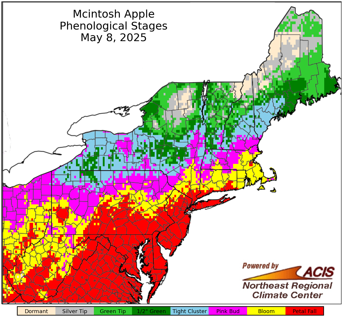
The Phenological Stages map shows the current estimated stage of bud development. These maps are produced from mid-September through the end of June and are updated three times a day around 11am, 1pm, and 3pm. This map is a product of the Northeast Regional Climate Center, and part of a set of Apple Frost Risk Maps.
Why is this tool needed?
While climate change is causing frosts and freezes to be less severe, spring frosts and freezes are not receding as quickly as flowering is advancing due to warmer temperatures, resulting in increased risk for damaging cold snaps. This tool, explained below, is designed to give a graphical view of your freeze risk, with a 6-day forecast included, based on 10%, 50%, and 90% damage temperature, for a variety of apple cultivars.
How does this tool work?
This tool uses the North Carolina Chilling Unit Model to estimate phenological stage of the apple varieties at your location in the Northeast. Lethal damage temperatures (T10%, T50%, and T90%) are known for the apple varieties shown, and the tool graphs minimum temperature versus damage probability for the estimated phenological stage at the selected location to produce a graph of past conditions, as well as a 6-day forecast. Daily maximum and minimum temperatures are calculated using 2.5 x 2.5 mile gridded data, allowing for temperature estimates at locations without a nearby weather station.
Producers can use this tool to:
- Determine the level of frost injury to crops due to sub-freezing temperatures
- Monitor the level of freeze tolerance of crops through time
- Track the phenological stage of development
How is our Apple Freeze Risk Tool unique?
Other frost risk websites refer the user to use Growing Degree Day (GDD) tools, and are not crop or variety-specific. Our tool takes into account damage levels of different crop varieties and plots it against projected and observed minimum and maximum temperature.
Unsure of what steps to take next? Click here to find your local Extension office for more detailed advice.